
10 Corner Exhibition Stall Design Mistakes to Fix Before Fabrication
Most expensive booth mistakes are not dramatic. They are ordinary decisions that looked fine in a clean render and became annoying once the stand was occupied.
A corner exhibition stall is mainly a visibility-and-movement problem. The footprint matters, but the more useful question is how a visitor experiences the stand from the aisle. In this format, two-direction visibility, an open corner and a layout that works from both aisles decide whether the booth feels clear or confused.
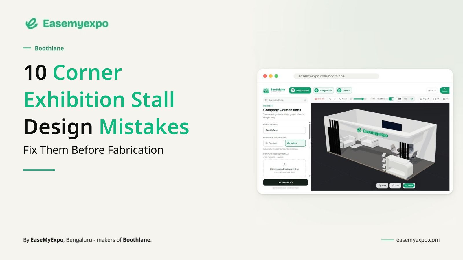
Boothlane by EaseMyExpo lets exhibition teams create, edit and review 3D stall concepts in the browser. The aim is not to replace technical design or fabrication. It is to make early decisions visible enough that marketing, design and fabrication teams can discuss the same thing before the build starts.
Quick Answer
What Are the Most Common Corner Booth Design Mistakes?
The most common corner booth design mistakes include blocking the two open sides, placing counters near entrances, using oversized furniture, hiding branding and leaving insufficient space for visitors. Poor storage planning and incorrectly positioned screens can also restrict movement. Reviewing the layout in 3D helps identify these problems before fabrication.
What Is a Corner Exhibition Stall?
A corner exhibition stall is a booth with two adjacent open sides, usually positioned at the end of an exhibition row. Unlike an inline stall, which has one open side, a corner stall allows visitors to approach from two aisles. This provides greater visibility but requires careful planning of entrances, branding, furniture and visitor movement.
For example, a 3m × 3m corner exhibition stall must accommodate displays, seating and reception areas without blocking either entrance. The layout should remain accessible from both sides, while branding should be visible to visitors approaching from different directions. Stall dimensions, height restrictions and structural requirements must follow the exhibition organiser's guidelines.
Why Do Corner Exhibition Stall Design Mistakes Matter?
Poor corner exhibition stall design can affect visitor access, brand visibility and the overall use of available space. A counter placed too close to an entrance may discourage visitors from entering, while oversized furniture can make a small booth feel crowded. Similarly, screens positioned near the aisle may cause visitors to gather outside the stall and block movement.
The best way to avoid these mistakes is to review the corner booth layout from both open sides before fabrication. Check how much space remains when chairs are occupied, storage doors are open and visitors are standing near displays. Using a 3D exhibition stall design platform such as Boothlane by EaseMyExpo can help teams visualise these arrangements, compare layouts and identify potential problems before approving the final design.
10 Corner Booth Design Mistakes to Fix
1. Treating every surface as a branding opportunity
Too many equal-weight messages make the stand slower to understand. Give one message visual priority.
2. Blocking an open side with a counter
A counter can become a physical and psychological barrier. Move it to the side or reduce its width if it narrows entry.
3. Reviewing only the front render
A corner booth has to be checked from both aisle directions and the diagonal corner view. A single hero view can hide weak angles.
4. Choosing furniture by appearance only
Real chairs need pull-out space. Real stools need knee room. Real cupboards need doors to open.
5. Forgetting staff positions
Staff occupy floor area all day. Design around where they stand between conversations, not only around visitor furniture.
6. Putting the screen where viewers create a queue
A screen that faces the aisle can attract attention but also create a blockage. Give viewers a place to stop inside the footprint.
7. Hiding storage too late
If storage is not planned, brochures, bags and bottles become visible clutter. Build concealed capacity into furniture early.
8. Approving decorative lighting without checking glare
Light that looks dramatic in a render can wash out graphics or reflect on displays. Review light direction, not only brightness.
9. Copying a reference booth without adapting the footprint
The useful part of a reference may be its palette or display logic, not the full geometry. Translate the idea instead of copying it.
10. Treating the concept as construction approval
A visual concept is a decision tool. Final heights, loads, materials, fire rules and engineering still need the event manual and technical team.
How Boothlane Helps With Corner Stall Design
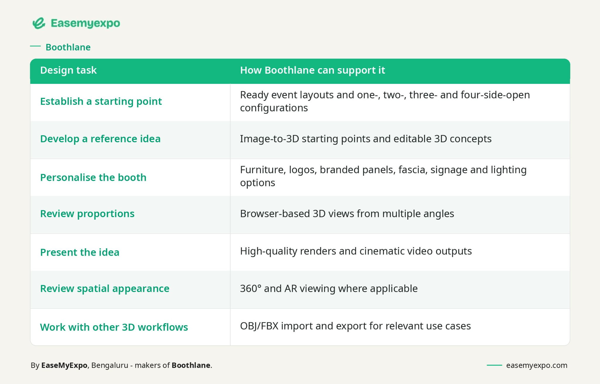
The useful part is not the number of features. It is being able to make a specific decision visible: whether a counter blocks entry, whether branding reads from an aisle, whether a product has enough clearance, or whether a meeting area is in the wrong place.
Example: Reviewing a 3m × 3m corner Corner Stall
Imagine an exhibitor with a 3m × 3m corner corner booth, three products, two staff members, brochure storage and one short-conversation area. The first version looks clean when empty, but the review should focus on use rather than appearance.
- Can the main product be seen from both aisle directions and the diagonal corner view?
- Can two visitors stop without standing in the main entry or exit path?
- Can a staff member stand behind the counter without closing the opening?
- Can chairs pull out and storage open without hitting another object?
- Does the primary brand message remain visible when people are inside the booth?
- Is there a clear difference between what is visually approved and what still needs technical validation?
If the answer to one of these is no, change the layout while it is still a concept. That is faster than discovering the issue after graphics are printed or furniture is already on site.
Corner Stall Design Checklist
- Dimensions: Confirm frontage, depth, orientation and usable clear floor area.
- Open sides: Confirm the two adjacent open side(s) and the actual aisle approaches.
- Brand visibility: Check the main message at walking distance and approximate eye level.
- Counter position: Make sure staff can use it without becoming the entrance barrier.
- Product access: Leave room to approach, inspect or demonstrate the main product.
- Furniture: Review occupied chairs, stools and working clearances.
- Storage: Keep supplies concealed while allowing doors or drawers to open.
- Screens: Give viewers a place to stand inside the booth footprint.
- Lighting: Check product emphasis, shadows and screen glare.
- Visitor flow: Test entry, stopping, conversation and exit as separate movements.
- Render review: Approve more than one camera angle.
- Technical check: Compare the concept against the specific event manual and fabricator requirements.
Who Can Use Boothlane for Corner Stall Planning?
- Exhibitors reviewing products, furniture, branding and visitor comfort before sign-off.
- Exhibition agencies developing early concepts and showing clients alternative directions.
- Fabricators clarifying the intended appearance before discussing materials and construction.
- 3D designers exploring layouts and presentation directions alongside specialist tools.
- Freelancers presenting faster concept options during client reviews.
- Marketing and sales teams checking messages, product emphasis and on-stand usability.
External Reference: Booth Types and Show Rules
NAMM defines a corner booth as a linear booth at the end of a series of inline booths with exposure to intersecting aisles on two sides, with linear-booth rules generally still applying.
NAMM Booth Display Types & Regulations
Use this as an example of how organisers define booth categories and sightline rules, not as a universal construction standard. Always check the manual for the specific exhibition you are attending.
Frequently Asked Questions
1. What is a corner exhibition stall?
A corner exhibition stall is an inline-style booth at the end of a row with two adjacent open aisle sides. The configuration affects visitor approaches, branding surfaces and how furniture or activities should be positioned.
2. How do you design a corner exhibition booth?
Confirm the booked footprint and organiser rules first. Then protect the two adjacent open sides, place the main visitor activity, add the minimum furniture required, and review the design from realistic aisle angles before approval.
3. Can I design a corner exhibition stall online?
Yes. Browser-based tools such as Boothlane support early-stage 3D concept development, branding, furniture placement and presentation views without installing heavy desktop software.
4. Does a 3D concept replace a fabricator drawing?
No. A 3D concept helps teams agree on appearance, layout and presentation. Fabrication drawings, engineering, material specifications, venue approvals and installation planning remain separate technical work.
5. What should I check before approving a corner booth?
Check approach visibility, entry clearance, occupied furniture, product access, storage, screen viewing positions, lighting, graphics and the relationship between the concept and the event manual. For a corner stand, pay particular attention to treat both aisles as real entrances rather than one entrance plus one side opening.
6. Can Boothlane create renders for internal approval?
Yes. Boothlane supports presentation outputs such as high-quality renders and cinematic views, helping stakeholders review the same concept before it is taken forward for fabrication.
7. Can a reference image be used as a starting point?
Yes. A reference image can be useful for colour, form, materials or display treatment. It should be adapted to the real footprint and event constraints rather than copied as if every booth has the same dimensions and rules.
8. Who should review a corner booth concept?
At minimum, involve the person responsible for the brand message, someone who understands the product or demo requirement, and the fabricator or technical team responsible for feasibility. Sales teams can also spot usability issues that a pure visual review misses.
Fix the Booth While It Is Still Easy to Change
Most booth problems are easier to fix in a browser than on a build-up day. Review the corner concept with people, movement and real dimensions in mind before anyone starts cutting material.